CONCEPT
設計主旨・作品解説
こもれびのクリニック 小川内歯科
Komorebi Clinic
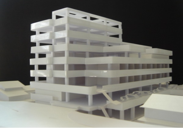
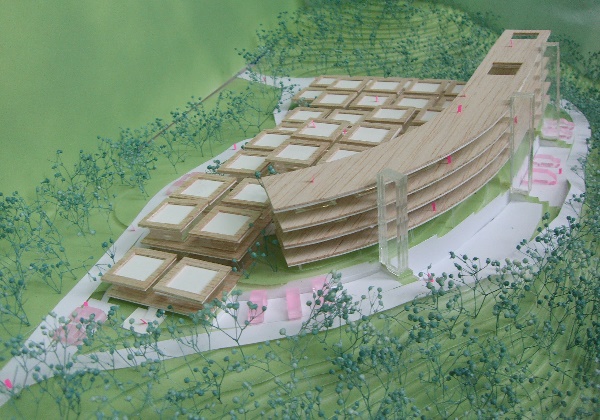
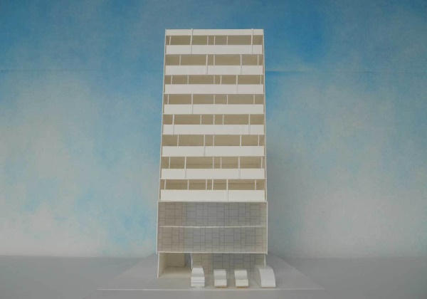
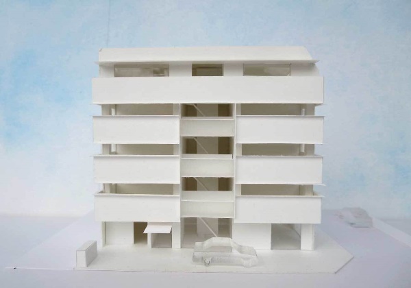
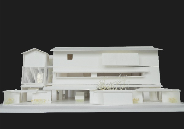
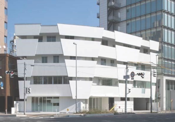
九州・佐賀県の小さな町で地域医療を担う歯科医院が、多様化したニーズに応えて治療・小児・矯正・予防を行う総合歯科診療所として刷新を図り、町の復興に貢献することを目指した建替えプロジェクトである。小さなコミュニティではこの医院は貴重な勤め先・近所付き合いの場として存在意義も大きい。医療建築に相応しい安全性や機能性、保守性などを満たすに留めず、人の触れ合いや自然との交わりを創出し、スタッフも患者も、心も身体も元気になれる「癒しの場」となり、地域の生活に新たな魅力を提供したいと考えた。
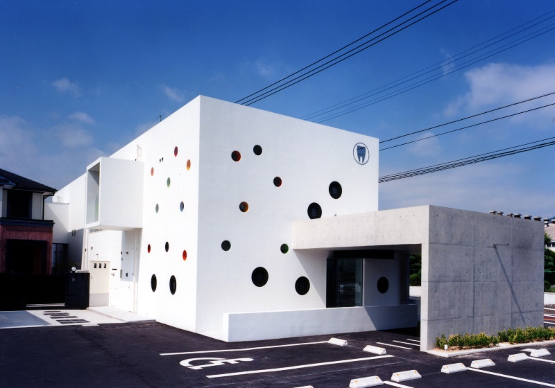
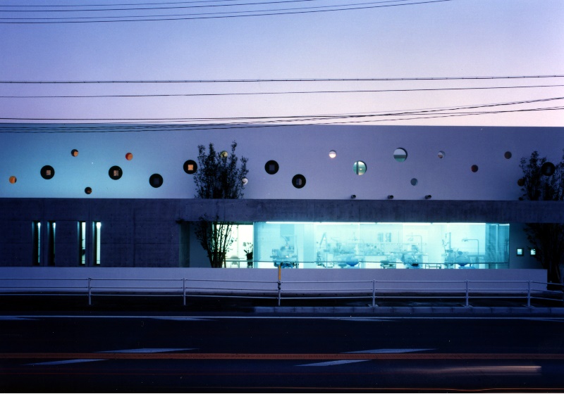
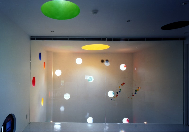
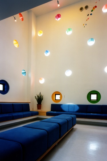
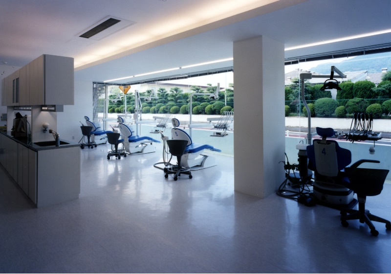
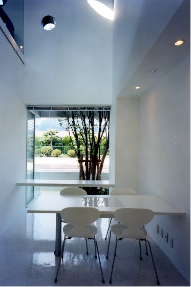
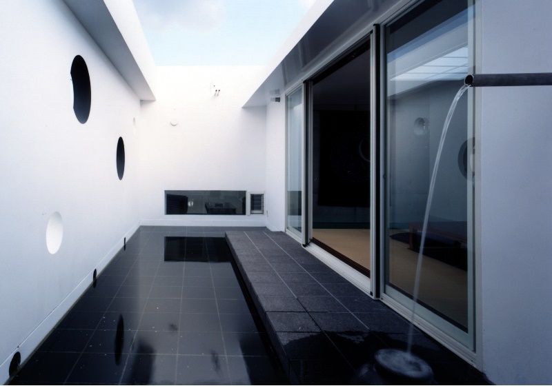
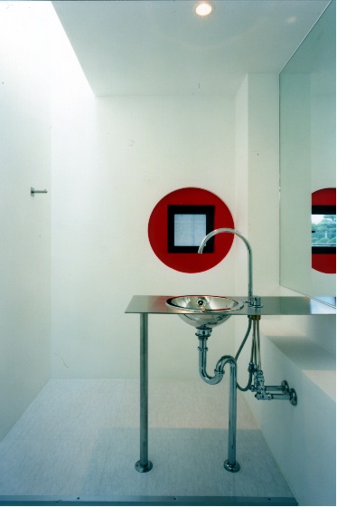
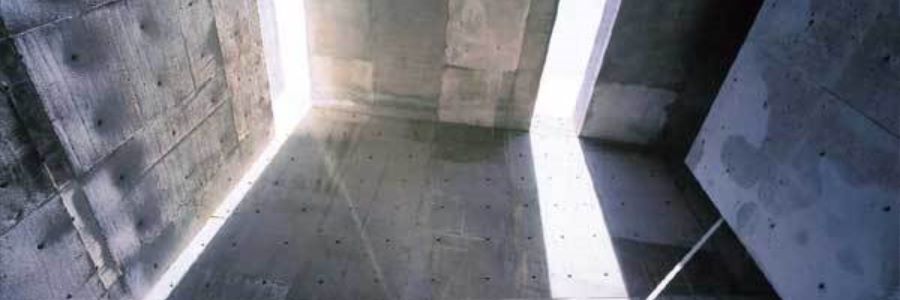
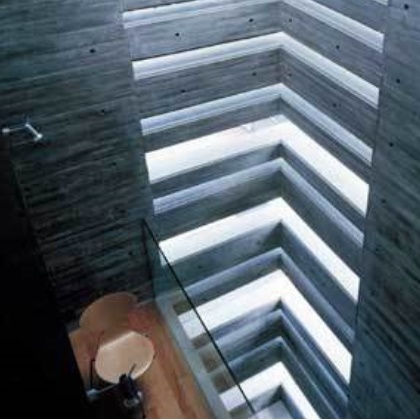
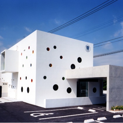
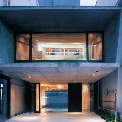
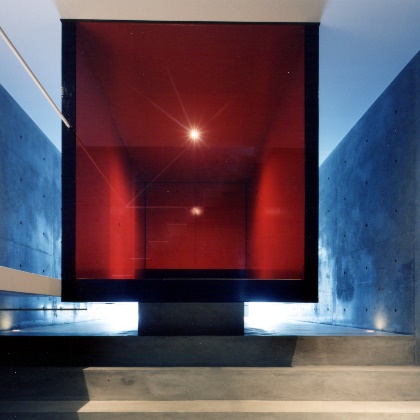
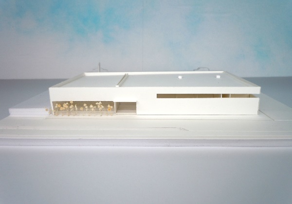
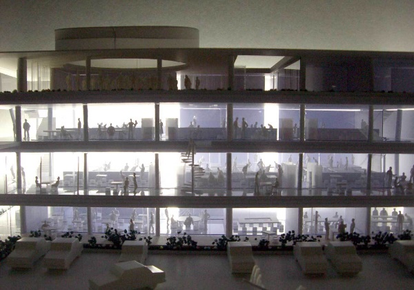
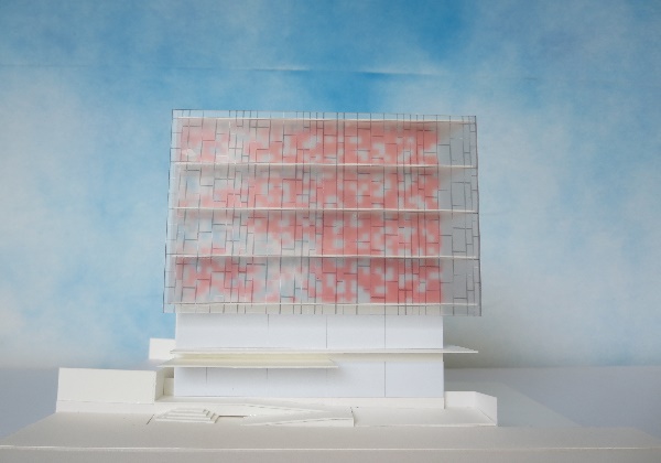
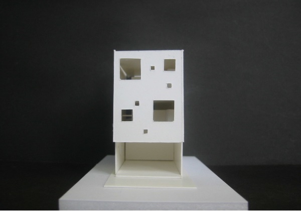
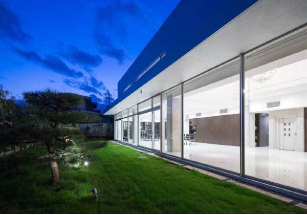
国道とJR線とに挟まれ、工場も近く、超軟弱なシルト層地盤から成る敷地である。構造体としてバランスに優れ、自らが安定地盤を形成し、振動と騒音とに耐え得る建築が求められたが、それを柔らかな空間を内包するための形態へと昇華させたいと考えた。建築で自然エレメントを抽出し、機敏溢れる表情で人を包み込むのである。木漏れ日の下、自然の大らかさに抱かれる心地好さがイメージとなる。小さな丸い開口が配された壁は優しい光で室内を満たし、吹抜けや大小の開口、トップライトを多用した断面は人や自然との触れ合いを様々に導いていく。診療室は細分化せず開放性を確保し、医療現場の透明性を高めた。
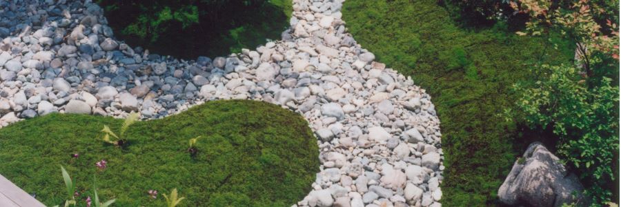
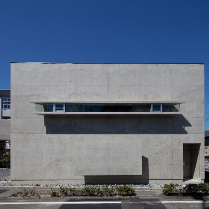
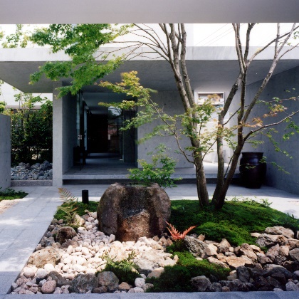
工事中でも旧建物で診療が継続でき、住居棟との直結経路が確保でき、建物自体が来院者への目印になる。そうした施主の要望によって建物の配置は国道寄りの敷地西側に限られたが、そこは国道と住居棟とに面した場所であり、建築を外へ開く形態に慎重を要した。セットバック、腰壁といった物理的な緩衝を図るとともに、緑の彩りが揺らぐ、水面がモアレを描く、水が音を奏で流れる、といった生命感溢れる自然の扱いを様々にデザインして心理面にも作用させ、二重のバッファ効果とした。
This was a project to construct a new building on the site of a dental clinic that offers medical services to the local residents of a small town in Kyushu, Saga Prefecture. In order to respond to the diversifying needs of patients, the clinic sought to remake itself as a general dental facility that would offer treatment, correction, prevention as well as dental care for infants, so as to contribute to the revitalization of the local community. In a small town such as this one, the clinic also serves as a valuable source of employment, as well as an important place of local interaction. The architecture of the clinic thus had to not only fulfill appropriate requirements regarding safety, functionality and serviceability, but also venture to offer something new to the local community by creating opportunities for social interaction and contact with nature, thus becoming a place of physical and emotional “healing” for both staff and patients.
Tucked between a national highway and a JR train route, the clinic is located on a site that stands on extremely weak, stratified silt soil close to several large factories. Although the client wanted a building with a well-balanced structure erected on stable ground with effective sound insulation and anti-shock fixtures, the project ended up transforming the existing structure into a form that would envelop and contain this soft space: using architecture to extract natural elements from the site, allowing the clinic to attend to its patients promptly and astutely. The overall impression of the clinic is one of well being – as if one were being embraced by the magnanimity of nature, basking in the komorebi (sunshine streaming through the foliage) of the overhanging trees. Gentle light entering through small round openings distributed all over the walls fills the interior, and cross-sections that generously incorporate open atria, large and small openings and skylights facilitate a variety of interactions with other people and the natural environment.
The clinic maintains a sense of openness without feeling fragmented, and the transparency of the treatment area has been enhanced. The client had three requests: 1) that the clinic remains open at the old location until the new building was complete; 2) that there be a direct passageway linking the new clinic to the residential wing; and 3) that the new building be easily recognizable for frequent visitors to the clinic. This resulted in a design that oriented the new building westwards facing the highway. The completed clinic overlooks both the highway and the residential wing, and care was taken to create a situation in which the architecture would open up to the outside. In addition to providing for physical buffers like setbacks and waist-high partitions, a second, psychological buffer layer was created by using various natural elements that exude a sense of vitality, such as swaying leaves, moiré patterns on water surfaces and the sound of flowing water. ( Ryuichi Furumoto )
